
Let's face it: designing a corporate logo that doesn't look like a generic stock template from 2008 is surprisingly hard. Many brands try to squeeze their entire history into a single emblem, ending up with a chaotic, unreadable mess.
American Design Hub observes startups make the same mistakes over and over. A high-converting logo isn't just art, it is a functional tool built for instantly recognizable visual communication.
Whether you're looking for custom logo design agencies or doing a complete brand overhaul, this guide breaks down Famous Logo Designs through a sharp, technical lens.
Key Takeaways
- The main types of corporate logos and when they work best
- Practical lessons from 35 recognizable brand identities
- How to assess a logo's simplicity, versatility, and distinctiveness
- Common logo design mistakes and how to avoid them
- How to evaluate logo design services before hiring a professional
What Makes a Logo Design Great?
Creating an effective logo requires balancing design principles with functional execution.
- Simplicity Makes Logos Easy to Recognize: Removing extra decorative elements ensures the primary visual hook registers instantly in the viewer's memory.
- Memorability Helps Brands Stand Out: A unique visual signature—whether negative space or a distinct curve—separates a brand from competitors.
- Timeless Design Reduces Redesigns:Classic geometric foundations survive changing visual trends, protecting long-term brand equity.
- Versatility Across Platforms:Logos must function flawlessly across responsive web layouts, app icons, physical merchandise, and large-format print.
- Color Choices Shape Brand Perception:Color selection directly influences psychological trust and industry alignment.
- Typography Expresses Personality:Custom letterforms create an intentional voice, ranging from authoritative corporate to approachable consumer-facing.
- Originality Prevents Trademark Issues:Distinctive design assets stand apart legally and visually from saturated market norms.
- Consistency Builds Trust: Uniform logo application across all channels establishes professional credibility over time.
What Can You Learn from These Famous Logo Designs?
- Match Your Logo to Brand Personality: Ensure graphic weight, color palette, and typography mirror your core value proposition.
- Prioritize High Contrast:High-contrast silhouettes remain readable in monochrome, low-resolution, or small-scale applications.
- Select Purposeful Typography:Choose serif fonts for heritage and authority, sans-serif fonts for modern clarity, or custom letterforms for unique identity.
- Design Vector-First:Build logos in vector formats to allow infinite scaling without quality degradation or pixelation.
- Plan for Long-Term Brand Growth: Avoid narrow visual metaphors that restrict future product expansions or pivot strategies.
Why Your Logo Matters More Than You Think
Your logo is the face of your business. It shows up on your website, invoices, vehicles, uniforms, and social profiles. Every time someone sees it, they make a small judgment about trust and quality. A clean, well-built mark makes people feel your business is organized. A messy one makes them wonder what else is messy.
Experts suggests good logos also give nostalgic feelings to netizens. A strong design can last 10 or 20 years with small updates. A weak one often gets replaced within a few years, and each redesign erases some of the recognition you built.
Ready to Build a Memorable Brand Identity?
Explore Our Logo Design ServicesTechnical Deep-Dives: 35 Iconic Corporate Logos
The following is a comprehensive technical analysis of all 35 logos, emphasising their design structure, strategic use of colour, and practical insights for your brand.
Types of Logos
Before you pick a direction, understand the main logo families. Designers group them into a few types of logos. Each type has trade offs.
- Wordmarks use only the company name in a custom or chosen typeface. They work well when the name is short and distinctive.
- Lettermarks use initials or a monogram. They suit long names but can feel less personal if overused.
- Pictorial marks use a symbol that represents the company. They are easy to recognize but often need time to build meaning.
- Abstract marks use shapes that suggest an idea. They can be powerful but need clear explanation.
- Emblems combine text and a symbol inside a shape like a badge or seal. They feel traditional and official.
- Mascots use a character. They are friendly and memorable but can limit a brand as it grows.
The examples below follow these groups.
Comparison Table of All 35 Top Types of Logos
| S.No | Logo | Industry | Style | Strongest Feature | Practical Lesson | Key Limitation |
| 1 | Technology | Wordmark | Clean legible letters | Choose a one color friendly palette | Multi color costs more | |
| 2 | Coca Cola | Beverage | Wordmark | Heritage script | Consistency builds trust | Hard to read small |
| 3 | Disney | Entertainment | Wordmark | Playful lettering | Letters set the emotion | Tone limits other sectors |
| 4 | LEGO | Toys | Wordmark | Bold rounded shapes | Bold shapes cross age groups | Less serious for services |
| 5 | Sony VAIO | Consumer technology | Wordmark | Analog digital concept | Concepts must read fast | Story may be missed |
| 6 | Gillette | Personal care | Wordmark | High contrast letters | Survives small packaging | Can feel dated |
| 7 | Chanel | Luxury fashion | Monogram | Symmetrical C letters | Restraint signals premium | Too strong for startups |
| 8 | BMW | Automotive | Lettermark roundel | Circle shape on badges | Verify your origin story | Color tied to one region |
| 9 | Hyundai | Automotive | Lettermark | Hidden handshake | Hidden meaning needs a strong base | Handshake often unseen |
| 10 | FedEx | Logistics | Hidden meaning | Forward arrow | Hidden details need support | Arrow lost at small sizes |
| 11 | Amazon | Retail | Hidden meaning | A to Z arrow smile | One shape, two messages | Concept is easy to imitate |
| 12 | Baskin Robbins | Food | Hidden meaning | Hidden 31 | Put the promise in the mark | Needs brand familiarity |
| 13 | Toblerone | Confectionery | Hidden meaning | Local bear in mountain | Local story adds authenticity | Bear is easy to miss |
| 14 | Carrefour | Retail | Negative space lettermark | Movement through space | Negative space must hold in one color | Can break in print |
| 15 | Apple | Consumer technology | Symbol | Clean silhouette | Remove anything unhelpful | Easy to feel copied |
| 16 | Nike | Sportswear | Symbol | Motion curve | Motion expresses performance | Hard for new brands to match |
| 17 | Shell | Energy | Symbol | Distinct pecten shape | Consistency earns trust | Heavy for other sectors |
| 18 | McDonald’s | Fast food | Symbol | Golden arches | Color and shape create shorthand | Yellow clashes with others |
| 19 | Adidas | Sportswear | Symbol | Repeatable stripes | Devices must stand alone | Legal disputes possible |
| 20 | Social media | Symbol | Flat camera update | Evolve style, keep core | Users resist change | |
| 21 | Beats by Dre | Audio | Symbol | Headphone figure | Customer at the center | Too specific for other fields |
| 22 | Tostitos | Snacks | Symbol | Shared moments | Sell the feeling | Details blur small |
| 23 | Mercedes Benz | Automotive | Symbol | Star of reach | Reach can mean ambition | Famous star feels generic |
| 24 | PlayStation | Gaming | Symbol | Control button shapes | Link symbol to experience | Meaning limited outside gaming |
| 25 | Starbucks | Coffee | Emblem | Detailed siren | Plan a simplified version | Detail hard on small items |
| 26 | National Geographic | Publishing | Emblem | Yellow frame | Containers can be ownable | Can look generic |
| 27 | Olympics | Sports events | Emblem | Interlocking rings | Shape expresses unity | Tied to the Games |
| 28 | Tour de France | Sports events | Emblem | Lettering with motion | Movement matches service | Fine detail is hard to copy |
| 29 | NBC | Media | Emblem | Colorful peacock | Color shows variety | Costly to print |
| 30 | WWF | Nonprofit | Mascot | Panda outline | One animal carries a mission | Ties brand to one species |
| 31 | MTV | Media | Mascot and system | Flexible core | Anchor change with a fixed core | Frequent change confuses |
| 32 | Unilever | Consumer goods | System | Icon grid | Icons show scale | Small elements disappear |
| 33 | Audi | Automotive | System | Four rings | Shapes tell history | Needs careful spacing |
| 34 | Cisco | Networking | System | Bridge inspired bars | Link to place only if useful | Can resemble signal icons |
| 35 | London Symphony Orchestra | Arts | System | Abstract baton motion | Keep abstract letters readable | Readability can suffer |
Wordmarks
1. Google
Source: Google
Google’s wordmark uses clean, rounded letters in four colors. The simple sans serif style reads well on a tiny search bar. The colors make the brand feel friendly and open, and the letters stay legible at any size.
The limitation is that multi color marks can cost more to print. Google keeps simpler versions for single color use.
Why We Chose This Logo to Help You?
When customers see this wordmark, they associate the brand with clarity and openness. The Google design team showed that bright colors and plain letters can feel friendly without looking childish.
Their standard is high because the logo still reads clearly on a small phone screen.
For your endeavour, choose one clean typeface and two or three colors that you can drop to a single color. Test the design at small sizes before you print anything.
Key Takeaway Choose a palette and typeface you can reproduce in one color.
2. Coca Cola
Source: Coca Cola
The Coca Cola script uses Spencerian style handwriting, a form used since the late 1800s. The bold red and white colors make it instantly visible on cans and signs. Its strength is heritage, which signals trust.
The script is hard to read at very small sizes and is difficult to change without losing identity.
Why We Chose This Logo to Help You?
This script tells people the brand has stayed loyal to its roots for generations. The team behind the logo chose a style that connects emotionally instead of chasing trends.
Their standard is high because they kept the look nearly unchanged while the world around it shifted.
For your endeavour, identify one signature element that customers already link to you. Protect it, use it everywhere, and let time build trust.
Key Takeaway Consistency over decades turns a simple script into a trusted asset.
3. Disney
Source: Disnep
Disney’s lettering feels handmade and playful. Its swashes and soft curves suggest storytelling.
The mark works on theme park signs, film openings, and merchandise. The limitation is tone. The style fits family entertainment well, but it would feel wrong for a law firm or a bank.
Why We Chose This Logo to Help You?
These letters promise stories and wonder before a single film or ride begins. The Disney team made custom lettering feel personal, almost hand drawn, so the name works like an invitation. Their standard is high because the mark sets expectations in seconds.
For your endeavour, choose letterforms that match the experience you deliver. Ask what feeling a customer should have in the first three seconds, then design the letters to create it.
Key Takeaway Your letterforms should match the feeling you want customers to have.
4. LEGO
Source: LEGO
LEGO uses bold, rounded red letters that look sturdy, like a toy brick. The strong shapes appeal to children and adults.
The mark stays simple, so it works on small plastic pieces and large packaging. The rounded style can look less serious for professional services.
Why We Chose This Logo to Help You?
Bold red letters tell customers the brand is playful, sturdy, and built to last. The LEGO team understood that a logo for kids must also earn respect from parents. Their standard is high because the mark works on toys, packaging, and theme park signs alike.
For your endeavor, pick one bold color and a solid letter shape that matches your product’s strength. Then confirm that the design still feels trustworthy to the adults who make buying decisions.
Key Takeaway Bold shapes and one strong color help a logo cross age groups.
5. Sony VAIO
Source: Sony VAIO
The VAIO mark uses wave-like forms and a digital feel to suggest the mix of analog and digital technology. The concept is clear once explained, but a viewer who does not know the story may see only abstract lines.
The mark works best when paired with the product name nearby.
Why We Chose This Logo to Help You?
This mark tells viewers that the product bridges two worlds, analog warmth and digital precision. The designers built a concept into the shape, which turns the logo into a short story. Their standard is high because they made technology feel human.
For your endeavour, find the one idea that makes your business different and express it through shape. Write a one sentence explanation of that idea, then check whether a stranger can sense it within seconds.
Key Takeaway A logo can carry a concept, but the concept must read quickly.
6. Gillette
Source: Gillette
Gillette uses a bold, high contrast wordmark with strong letter weight. The heavy letters remain readable on small razor packaging and in store shelves.
The look suggests reliability and precision. The limitation is that the style can feel dated for brands aiming at younger audiences.
Why We Chose This Logo to Help You?
Strong, sharp letters tell customers the brand values precision and reliability. The design team built the mark for small packaging and crowded shelves, where weak lettering disappears. Their standard is high because the logo stands out across a store aisle.
For your endeavour, design for the places where customers actually see you. Print a sample for a shelf, a truck door, and a phone screen. If it stands out in each setting, it is ready.
Key Takeaway Strong contrast helps a wordmark survive on small packaging.
Lettermarks and Monograms
7. Chanel
Source: Chanel
Chanel’s interlocking C letters form a balanced, symmetrical monogram. The curves feel elegant, and the mark needs no extra words to signal luxury. Because it is so restrained, it has stayed relevant through many fashion trends.
The limitation is that a monogram this strong can feel out of place for a new startup without a luxury position.
Why We Chose This Logo to Help You?
The interlocking Cs say luxury without a single extra word. The Chanel team chose balance and restraint, two qualities that signal confidence. Their standard is high because a monogram this simple has lasted through decades of fashion cycles.
For your clothing business, avoid clutter and trend chasing. Use a clean, symmetrical mark that reflects your quality, then apply it with the same care on packaging, invoices, and your website footer.
Key Takeaway Symmetry and restraint build a premium feel that lasts.
8. BMW
Source: BMW
The BMW roundel uses blue and white, two colors linked to Bavaria, the company’s home region. A popular story says the roundel shows a spinning propeller. BMW’s own explanation credits the Bavarian colors, and the propeller idea is widely considered a myth.
The circle reads well on car badges and steering wheels. The limitation is that the color story stays tied to one region.
Why We Chose This Logo to Help You?
This roundel tells customers that the brand values heritage and engineering pride. BMW kept its blue and white colors tied to its home region, which gives the brand a real anchor. Their standard is high because the company stays open about the design’s origins.
For your endeavour, learn the true story behind your name and colors. Share it plainly. Customers trust a brand that tells the truth about where it came from.
Key Takeaway Check the true story behind your design before you share it with customers.
9. Hyundai
Source: Hyundai
Hyundai’s logo uses a stylized H whose negative space suggests two people shaking hands. The handshake symbolizes trust with customers. The clean lines keep the mark modern.
The limitation is that many viewers see only the H, so the hidden meaning may go unnoticed.
Why We Chose This Logo to Help You?
Customers see a letter H and a quiet message about trust and partnership. The design team hid the handshake in negative space, rewarding viewers who look closely. Their standard is high because the mark works as a letter first and the meaning sits beneath it.
For your endeavour, layer meaning carefully. Make sure the basic shape stands alone, then add a hidden detail that supports your promise. Test it with people who have never heard your story.
Key Takeaway A hidden meaning works best when the basic letter still stands on its own.
Hidden Meaning Logos
10. FedEx
Source: FedEx
Designer Lindon Leader created the FedEx logo in 1994. The white arrow between the E and the X forms in negative space. The arrow suggests speed and forward motion. The limitation is size. On small prints or low resolution screens, the arrow can disappear.
Why We Chose This Logo to Help You?
This arrow tells customers the company moves fast and keeps its promises. The designers placed the arrow in negative space, so the message feels discovered rather than forced. Their standard is high because the mark became a conversation starter.
For your specific endeavour, look for a hidden idea that connects to your service. Use it as a bonus detail, not the whole message. Keep the main letters strong so the mark still works when the detail is too small to see.
Key Takeaway Hidden details reward close viewers, but they cannot carry the whole message.
11. Amazon
Source: Amazon
The arrow runs from the A to the Z and curves into a smile. It suggests that the company sells everything and that customers leave happy. The shape is easy to draw and scale. The limitation is that the arrow concept is simple enough that many brands use similar ideas.
Why We Chose This Logo to Help You?
This arrow tells customers that the store carries nearly everything and that buyers will be happy. The team combined a letter span and a smile into one curve. Their standard is high because a single shape communicates two ideas at once.
For your specific endeavour, ask what two promises you make to customers. Look for a shape that carries both. Keep it simple enough to draw in a few seconds.
Key Takeaway A simple shape can carry two clear messages.
12. Baskin Robbins
Source: Baskin Robbins
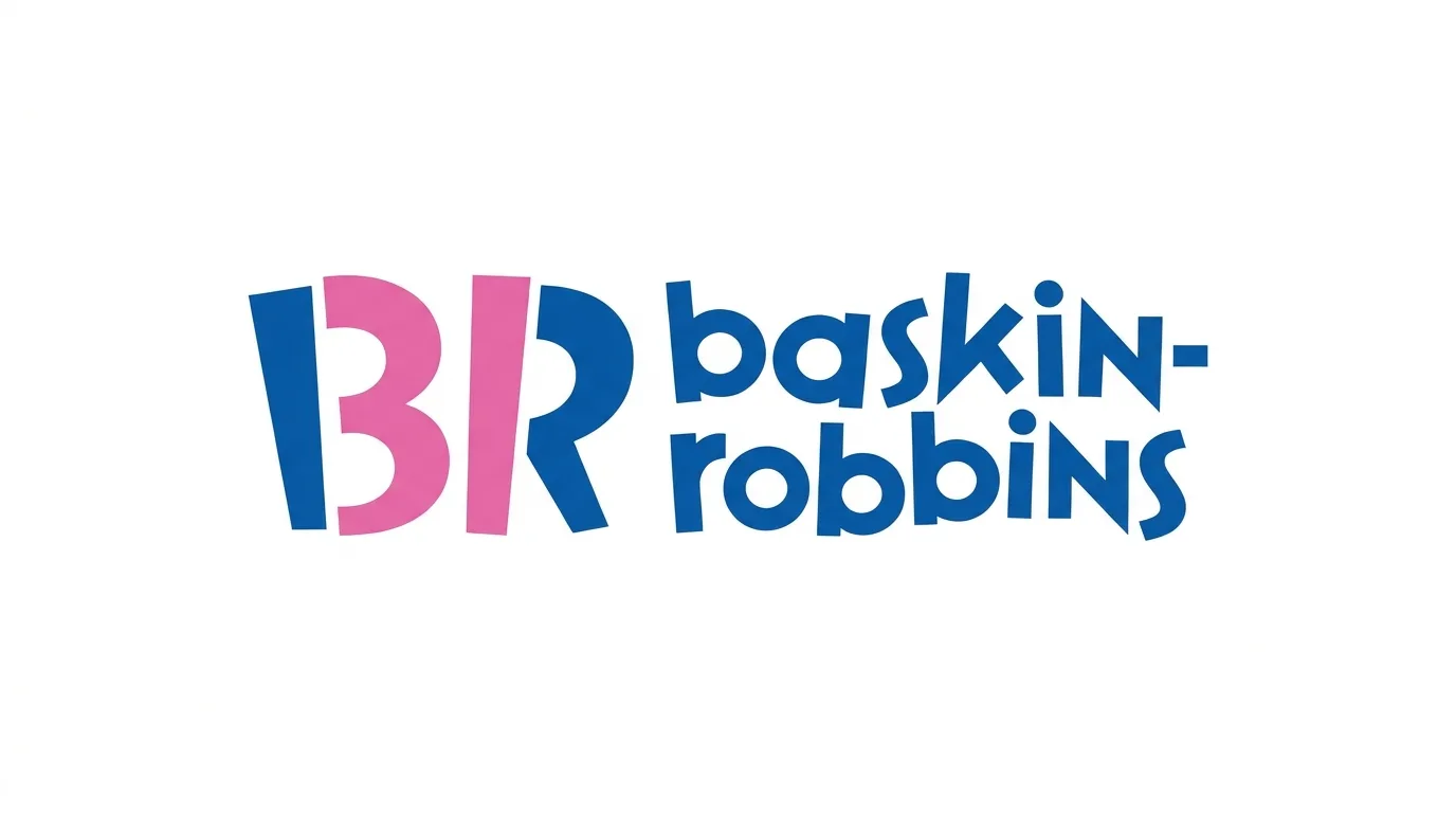
Most people cite the design as hiding the number 31 in the space between the B and the R. That number refers to the company’s 31 flavors. The reveal rewards curious viewers and supports the brand promise of variety. The limitation is that the hidden number works best for people who already know the brand.
Why We Chose This Logo to Help You?
The hidden 31 tells customers the brand offers variety and fun. The designers turned the promise of many flavors into a small surprise. Their standard is high because the mark rewards people who look closely.
For your specific endeavour, put your strongest promise into the logo where possible. A customer who spots it feels smart and connects with your brand faster. Test whether people can explain the hidden idea after one look.
Key Takeaway Put your core promise inside the mark when people can read it quickly.
13. Toblerone
Source: Toblerone
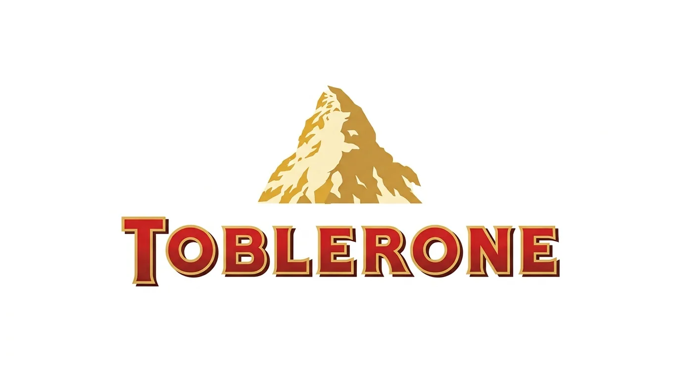
The Toblerone logo places a bear standing upright inside the outline of the Matterhorn mountain. The bear references Bern, the Swiss city known for bears. The local story gives the brand authenticity. The limitation is that the bear is small and easy to miss.
Why We Chose This Logo to Help You?
The bear and mountain tell customers the brand has Swiss roots and local pride. The designers tied the product to a real city, which gives the story depth. Their standard is high because the local symbol feels natural rather than forced.
For your endeavour, search your own community for a symbol people already respect. Build a short story around it. Then make sure the symbol survives on a small wrapper or a website icon.
Key Takeaway Local heritage can set you apart, but the story must survive a small size.
14. Carrefour
Source: Carrefour
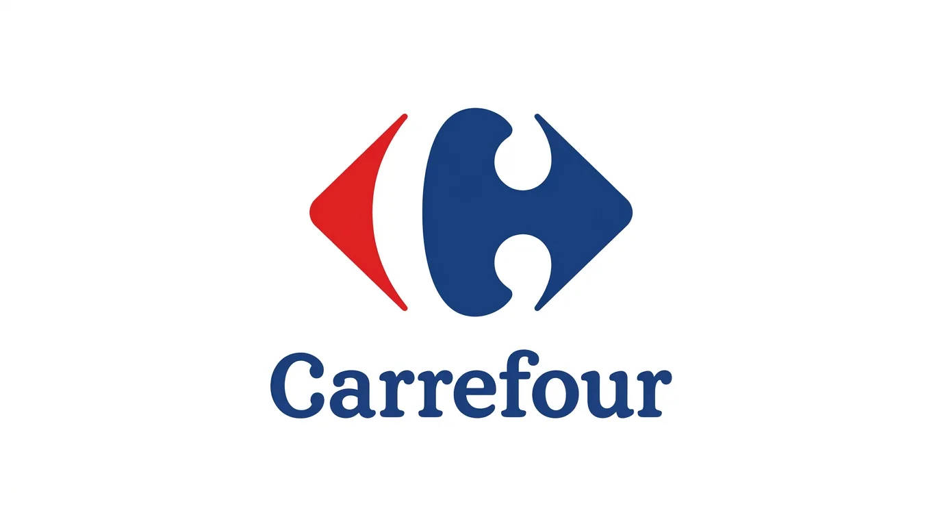
Carrefour’s logo uses a simple lettermark built around the letter C. Negative space adds movement, which suggests progress toward the customer. The clean geometry reads well across store signs and digital ads. The limitation is that negative space can fill in or break apart when printed in one color.
Why We Chose This Logo To Help You?
This lettermark tells customers the store is easy to reach and always moving forward. The design team used negative space to create motion without clutter. Their standard is high because the logo works on large store fronts and small digital ads.
For your business, explore negative space when you need a clean mark. Check it in one color before you approve it. If the shape breaks apart on a stamp or a fax, simplify it.
Key Takeaway Negative space works best when it stays visible in one color.
Symbols and Icons
15. Apple
Source: APPLE
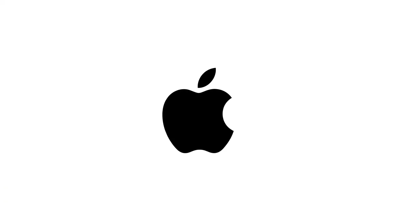
The apple silhouette is simple and easy to recognize. Apple moved from a rainbow design in earlier decades to a single color mark. The monochrome version scales perfectly and fits any product surface. The limitation is that the mark is so strong that any similar shape would look like a copy.
Why We Chose This Logo to Help You?
The apple silhouette tells customers the brand values simplicity and polish. The design team removed every detail that did not help people recognize the company. Their standard is high because a single color mark works on a laptop, a billboard, and a tiny icon.
For your endeavour, ask what you can delete. Remove any detail that does not aid recognition. Then test the final mark in black, in white, and at icon size.
Key Takeaway Remove every element that does not help people recognize you.
16. Nike
Source: Nike
Designer Carolyn Davidson created the swoosh in 1971 for a fee widely reported as 35 dollars. The curve suggests motion and speed in one stroke.
Nike can use the swoosh without the name, which shows how well it works. A new brand would need time to earn that level of recognition.
Why We Chose This Logo to Help You?
The swoosh tells customers the brand is built for movement and performance. The creative team built a symbol that works with or without the name. Their standard is high because the swoosh has stayed powerful for decades.
For your endeavour, use motion in your design when your service involves speed or progress. Draw one flowing line and check whether it captures your message. Simplicity makes that line memorable.
Key Takeaway Motion lines can express performance in a single stroke.
17. Shell
Source: Shell
Shell’s pecten shell has been part of the brand since the early 1900s. The yellow shell on a red background stands out on gas stations and signs. Long use builds trust.
The limitation is that the symbol is closely tied to the oil industry, so it may feel heavy for other sectors.
Why We Chose This Logo to Help You?
The shell tells customers the brand has a long history and a steady presence. The design team kept the symbol consistent across decades of signs and products. Their standard is high because repetition built trust.
For your company, choose a symbol you can use for years without major change. Lock colors and proportions in your style guide. Consistency teaches customers to recognize you before they read a word.
Key Takeaway Long running symbols earn trust, but only when you keep them consistent.
18. McDonald’s
Source: McDonald
The golden arches form a large M that people recognize from highway signs. The yellow and red colors are bright and appetizing. The shape works at a glance from a moving car.
The limitation is that bright yellow can clash with other brands in the same market.
Why We Chose This Logo to Help You?
The golden arches tell customers they can spot the brand from far away. The team turned a letter into a color and shape pair that works on highway signs. Their standard is high because the arches stay recognizable across many countries.
For your food cart or business, look for a color and shape pair that can act as shorthand for your brand. Test it from a moving car or across a parking lot. If people recognize it at a distance, the design is doing its job.
Key Takeaway A color and shape pair can become shorthand for your brand.
Turn Your Brand Vision Into a Powerful Logo
Get a Custom Logo Design19. Adidas
Source: Adidas
The three stripes are simple and repeatable. They work on shoes, shirts, and bags, even when used alone.
The company has also defended the stripes in legal disputes, which shows how valuable a simple device can become. The limitation is that similar stripe designs can cause legal trouble for new brands.
Why We Chose This Logo to Help You?
The three stripes tell customers the product is athletic and dependable. The design team created a simple device that works alone on shoes and clothing. Their standard is high because the stripes work on every product type.
For your endeavour, design one repeatable element and use it on products, packaging, and social posts. Also check legal rights before you adopt any shape that resembles another company’s mark.
Key Takeaway A simple device works best when it stands alone on a product.
20. Instagram

Source: Instagram
The 2016 redesign replaced the retro camera icon with a flat camera and a colorful gradient. The brand kept the camera shape people knew while modernizing the style.
The limitation is that users often resist change, so the update needs clear communication.
Why We Chose This Logo to Help You?
The camera icon tells customers the app is about photos and sharing. The design team modernized the style while keeping the core shape people knew. Their standard is high because they updated the look without losing recognition.
For your endeavour, plan updates as evolutions. Keep the core shape and change the style in small steps. Explain each change to your audience so they feel included, not confused.
Key Takeaway Evolve your style, but keep the core shape people already know.
21. Beats by Dre
Source: Beats by Dre
The lowercase b shape resembles a person wearing headphones. This design puts the listener at the center of the product story.
The shape is memorable and fits product packaging well. The limitation is that the figure is so specific that the mark may not fit brands in other industries.
Why We Chose This Logo to Help You?
The headphone figure tells customers the product is built around the listener. The design team turned a simple letter into a story about personal experience. Their standard is high because the mark connects the brand to the user’s life.
For your business, focus on the customer at the center of your work. Find a shape that shows who benefits. Keep the design clean enough for packaging and digital ads.
Key Takeaway Turn a simple shape into a story about the customer.
22. Tostitos
Source: Tostitos
The mark shows figures sharing chips. It suggests friends, parties, and social moments. The idea sells the experience instead of just the product. The limitation is that the small illustrated details can blur on small screens.
Why We Chose This Logo to Help You?
The shared chips tell customers the brand is about gatherings and friendship. The design team sold a feeling, not just a product. Their standard is high because the mark makes people picture the moment before they open the bag.
For your endeavour, show the experience your customers want. Ask what happens when they use your service. Then build one simple visual around that moment.
Key Takeaway Show the feeling your product creates, not just the product.
23. Mercedes Benz

Source: Mercedes Benz
The three pointed star stands for land, sea, and air, according to the company. The star feels stable, premium, and ambitious.
The circle around it adds balance. The limitation is that the star is so famous that new brands could look generic if they copy the idea.
Why We Chose This Logo to Help You?
The three pointed star tells customers the brand aims for excellence on land, sea, and air. The design team created a symbol that feels stable, premium, and ambitious. Their standard is high because the star has kept its power for generations.
For your brand, choose a symbol that reflects your ambition. Keep the lines balanced and the shape easy to reproduce on metal, glass, and print.
Key Takeaway A symbol that suggests reach can also express ambition.
24. PlayStation

Source: Play Station
The four shapes are a triangle, a circle, a cross, and a square. They match the face buttons on game controllers. The symbols connect the brand to gameplay in a fun way.
The limitation is that the shapes mean little outside gaming.
Why We Chose This Logo to Help You?
The four shapes tell gamers that the brand lives in the middle of play. The design team linked the logo to controller buttons, so the symbol feels real to users. Their standard is high because the shapes stay meaningful across the gaming world.
For your endeavour, connect your symbol to a real part of the experience. Ask users what they notice in your product, then use their language to guide the design.
Key Takeaway Tie your symbol to the real product experience.
Emblems and Badges
25. Starbucks
Source: Starbucks
The siren in the Starbucks emblem is a twin tailed figure inspired by old Norse woodcut art. Detail adds story and character. Over time, the company simplified the design to work at small sizes.
The limitation is that detailed emblems are hard to reproduce on cups, signs, and phone screens.
Why We Chose This Logo to Help You?
The siren tells customers the brand has an old world story and a sense of adventure. The design team built a detailed emblem and later simplified it for everyday use. Their standard is high because they balanced rich storytelling with practical reproduction.
For your start up, create a full emblem for brand materials and a simplified version for small uses. Keep both consistent so customers connect the two without effort.
Key Takeaway Detail is valuable, but plan a simplified version for small uses.
26. National Geographic
Source: National Geographic
The yellow rectangle frame acts as a bold container for the brand name and symbols. It works as a stamp on photos, documents, and maps.
The frame gives the mark a clear boundary. The limitation is that the frame alone can look generic if used without care.
Why We Chose This Logo to Help You?
The yellow frame tells customers the brand brings the world into focus. The design team built a container shape that works around photos, text, and maps. Their standard is high because the frame feels ownable.
For your business, look for a simple container that holds your message. Test it with real photos and documents. If the frame still signals your brand over a blank image, your system is strong.
Key Takeaway A simple container can become an ownable brand asset.
27. Olympics
Source: Olympic
The five interlocking rings were introduced in 1913. The rings are widely described as representing the five continents, and the colors often link to the flags of participating nations.
The design communicates unity without words. The limitation is that the rings are so tied to the Games that other brands cannot use them.
Why We Chose This Logo to Help You?
The five rings tell viewers that people around the world can unite around shared goals. The design team used one shape to express a big human idea. Their standard is high because the rings are understood across languages and cultures.
For your specific endeavour, whatever it is, whether a company, brand or a simple shop, decide the one big idea you want customers to remember. Express it through a simple shape. Then test whether people feel the message before they read your name.
Key Takeaway Shape can express a big idea like unity without a single word.
28. Tour de France
Source: Tour De France
The logo mixes bold lettering with a cycling illustration. Motion fits a race that lasts weeks. The design works on posters, race maps, and merchandise.
The limitation is that fine illustrated details are hard to reproduce on small items.
Why We Chose This Logo to Help You?
The mix of lettering and cycling imagery tells viewers the event is fast, demanding, and a little heroic. The design team matched the logo to the pace of the race. Their standard is high because the mark works on posters, race maps, and merchandise.
For your endeavour, match your logo to the pace of your service. Fast service needs energetic lines. Calm service needs steady shapes. Then check that the energy holds on a small sticker.
Key Takeaway Movement can match the pace of your service.
29. NBC
Source: NBC
The NBC peacock uses many colored feathers to show a range of programs. Color expresses variety and entertainment.
The design became a strong symbol of the network. The limitation is cost. Many colors can be expensive to print and difficult to reproduce in one color.
Why We Chose This Logo to Help You?
The colorful peacock tells viewers the network offers variety and entertainment. The design team used color as a message, showing many programs in one symbol. Their standard is high because the peacock became a signal of the brand’s range.
For your efforts, use colour to indicate variety only when it is significant to your customers. Prepare a single-colour version for print and stamps. Colour helps you stand out, but the single-colour mark must remain effective.
Key Takeaway Color can express variety, but every colorful logo needs a single color backup.
Mascots and Systems
30. WWF
Source: WWF
The giant panda in the World Wide Fund for Nature logo was designed by artist Gerald Watterson in 1961. One animal communicates a conservation mission quickly. The simple outline works across campaigns.
The limitation is that a mascot links the brand to one species, which can limit the message.
Why We Chose This Logo to Help You?
The panda tells people the brand cares about wildlife and conservation. The artist turned one animal into a clear, friendly symbol that works across campaigns. Their standard is high because the mark earned trust for a serious mission.
For your project, choose a simple image that reflects your goal. Make it welcoming enough to gain support. Use the same style in every campaign so people recognise the cause.
Key Takeaway A simple animal can carry a complex mission in one image.
31. MTV
Source: MTV
MTV’s logo has changed many times over the decades. The flexible design allows new looks while the core stays recognizable.
The approach suits a media brand that needs to feel current. The limitation is that frequent changes can confuse viewers who want consistency.
Why We Chose This Logo to Help You?
The flexible logo tells viewers the brand changes with culture. The design team built a system with a strong core and room for new looks. Their standard is high because the brand stayed current for decades.
For your project, make your identity adaptable. Keep one constant part, like a main shape or colour, and allow the rest to change with your audience. Write down the guidelines so every version still feels like it belongs to you.
Key Takeaway Flexibility works when a fixed core anchors every version.
32. Unilever

Source: Unilever
The Unilever mark uses a grid of small icons, each representing a brand in its family. The design shows scale and variety in one unified image.
The limitation is that many small elements disappear on small surfaces.
Why We Chose This Logo to Help You?
The icon grid tells customers that many brands belong to one family. The design team showed scale and variety in a single unified image. Their standard is high because they made a large portfolio feel connected.
For your endeavour, show how your services fit together. Create a simple system of icons or colors that links them. Simplify the system for small surfaces so it stays readable.
Key Takeaway A system of icons can show scale, but it must simplify for small uses.
33. Audi
Source: Audi
The four rings represent four companies that joined together in the early 1930s. The rings express unity and shared history.
The shape is balanced and easy to recognize. The limitation is that four rings need careful spacing to stay clear at small sizes.
Why We Chose This Logo to Help You?
The four rings tell customers the company formed from four proud histories. The design team used a balanced, repeating shape to show unity and shared heritage. Their standard is high because the shape conveys history without any text.
For your endeavour, look at your own story. Find a shape that expresses how your team or services came together. Space the shape carefully so it reads clearly at every size.
Key Takeaway A shape can tell a company history without any text.
34. Cisco
Source: Cisco
Cisco’s bars are often linked to the Golden Gate Bridge, a nod to the company’s Bay Area roots. The shape also suggests signal and connection.
The idea links the brand to a real place. The limitation is that the symbol can look like a wireless signal icon, which may confuse viewers.
Why We Chose This Logo to Help You?
The bar shapes tell customers the company connects people and networks. The design team linked the mark to a real place, which gives the brand a grounded story. Their standard is high because the logo feels both technical and human.
For your specific endeavour, decide whether your location adds meaning. If it does, use it. If it does not, skip it. Also test whether your symbol could be mistaken for a wireless signal icon.
Key Takeaway Connect your logo to a real place only when the link adds meaning.
35. London Symphony Orchestra
Source: London Symphony Orchestra
The orchestra’s abstract lettering suggests the movement of a conductor’s baton. The design shows rhythm and music in a modern way.
The limitation is readability. Abstract letters must still be easy enough to read as the orchestra’s name.
Why We Chose This Logo to Help You?
The abstract letters tell audiences the orchestra brings movement and rhythm to music. The design team used letter shapes that feel like a conductor’s gesture. Their standard is high because the mark expresses art without losing the name.
For your company, use abstract shapes only when they still spell your name clearly. Test readability with people who have never seen the logo. Keep the energy and the clarity.
Key Takeaway Abstract letters must stay readable.
Lessons From Iconic Logos
Across the 35 examples, a few patterns stand out. First, the best logos commit to one core idea and let everything else support it. Second, the most durable marks reduce detail over time. Starbucks kept its siren but simplified it.
Apple dropped color. Third, the strongest brands use their logo the same way every time. Recognition builds through repetition, not through novelty. Fourth, hidden meanings add delight but never replace clarity.
Finally, the best designs reflect the business’s real story. A logo that claims something the company does not do will eventually lose trust.
How to Choose the Right Corporate Logo?
Choosing a logo is a business decision, not just an art decision. Use this process:
- Define the message. Write three words that describe how customers should feel about your company.
- Pick a logo type.Use the groups above. A long name often suits a wordmark or lettermark. A short, distinctive name can carry a symbol.
- Test in one color.Print the logo in black. If it loses meaning, simplify it.
- Check small sizes.View the logo at the size of a social profile icon. Remove anything that blurs.
- Check ownership. Search for similar trademarks before you fall in love with a design.
- Get feedback from real customers.Show the options to people outside your team and ask what they remember after five seconds.
Your logo should work on your website, your van, your invoices, and your merchandise. If one of those uses fails, adjust the design before you launch.
Common Logo Design Mistakes
- Too many elements. Each added shape weakens memory.
- Trendy effects. Gradients, shadows, and glow effects often look dated within a few years.
- Weak contrast.Light colors on white backgrounds disappear on screens and print.
- Tiny details.Thin lines and small text vanish at small sizes.
- No one color version.A logo that requires color to work will fail on fax, stamps, and some packaging.
- Copying competitors.Similar marks confuse customers and can create legal risk.
- Hidden meanings with no base.A clever secret means nothing if the main shape is weak.
- Unclear type choice.A long name forced into a symbol usually reads poorly.
Top Logo Design Companies and When to Hire Help
Some business owners design their own logos with free or low cost tools. That can work for a very small venture, but a logo is hard to judge objectively when you are close to the brand.
Professional logo designers bring research, process, and testing. Look for a team that shows a clear process, asks about your audience and goals, and provides files in vector formats.
Vector files scale without losing quality, which matters for signs and print. Ask for a full logo package with color, one color, and reversed versions. Also ask who owns the final files and how revisions work before you sign.
If you search for top logo design companies, compare them by portfolio quality, process, and how they explain their decisions. A good team explains the reasoning behind each choice, not just the look.
When Your Brand Needs a Logo Redesign?
Not every business needs a new logo. Still, certain signs show it may be time. Your logo looks dated compared with competitors. It breaks down on digital screens or small icons.
Your business has changed direction, such as moving from retail to services. You merged with another company. Your audience has changed, and the logo no longer speaks to them.
A redesign should keep recognition whenever possible. Instagram’s update shows that a brand can modernize and keep its core shape.
Make small improvements before a full overhaul. Adjust spacing, simplify details, and update colors first to modernize your identity cleanly.
Only replace the mark completely when the business meaning has changed. Start refining today, because your brand needs a logo redesign that lasts.
Parting Words
A great logo does far more than look clean on a business card. It carries your brand identity, sets the tone for your business, and builds trust with your audience from the very first glance. From iconic shapes to custom typography, every memorable logo relies on simplicity, scalability, and deliberate design choices that stand the test of time.
If you want your brand to leave a lasting impression, settling for generic templates simply will not cut it. You need a distinct visual identity that sets you apart from the crowd and scales effortlessly across every platform.
Ready to transform your visual identity into an iconic global asset? Partner with the experts at American Design Hub to elevate your brand with professional logo design services.
Ready to Make Your Brand Stand Out?
Start Your Logo Design ProjectFrequently Asked Questions
The top 10 corporate logos of all time include Apple, Nike, Coca-Cola, McDonald’s, FedEx, Amazon, Google, Mercedes-Benz, Shell, and Target.
These Top Corporate Logo Design Examples rely on clean geometry, clear silhouettes, and memorable visual metaphors that stay recognizable across every global market.
The top 10 logo designers are Paul Rand, Saul Bass, Milton Glaser, designers of Chermayeff & Geismar & Haviv, Massimo Vignelli, Rob Janoff, Carolyn Davidson, Lindon Leader, Paula Scher, and Herb Lubalin.
Their iconic company logos ideas shaped modern graphic identity, proving how simple typography and clever symbols create timeless visual heritage.
The best logo design trends for 2026 feature micro-details as visual anchors, warm organic minimalism, dynamic morphing shapes, adaptive wordmarks, and heritage-inspired custom typography.
Modern brands favor modern logos that blend clean digital scalability with subtle human details to stand out in saturated online marketplaces.
A good corporate logo combines instant recognition, functional simplicity, scalable vector geometry, and strategic brand alignment. It acts as an anchor for customer trust while maintaining visual clarity across mobile screens, packaging, print ads, and large outdoor displays.
Exploring a strong logo design example shows how minimalism drives visual impact
The 5 essential elements of a good logo are simplicity, memorability, versatility, timelessness, and relevance.
A great mark uses balanced typography and purposeful color palettes to communicate brand authority, avoiding temporary design trends to ensure the core identity scales cleanly across all physical and digital platforms.
Apple’s monochromatic silhouette logo is widely considered the most recognizable company emblem worldwide.
Its clean outline, scaled bite mark, and minimalist vector design make it instantly recognizable across all global cultures, setting a high standard among nice logos in modern consumer tech.
Among major global tech brands, Instagram released a notable refined wordmark designed by Koto.
The updated mark features a simplified script gesture in the “gr” ligature, demonstrating how legacy platforms update their identities to maintain high-resolution clarity across web and mobile app interfaces.
Avoid overly complex illustrations, trendy gimmicks, poor letter spacing, and heavy reliance on color gradients. Complex designs fail at small screen sizes, while uninspired stock vectors harm brand originality.
Focusing on simple, high-contrast shapes creates distinctive logo examples that remain readable in pure black and white.
Logos that attract customers feature clean geometry, balanced visual contrast, approachable typography, and clear color psychology.
Simple visual hooks, like subtle negative space or warm organic shapes, build instant emotional resonance and foster long-term brand recall across diverse customer audiences.
